
FAST Graphs alternative
Price-versus-earnings charts, free.
See whether a stock’s price has run ahead of its earnings, across up to 30 years of history, without a subscription.
FAST Graphs made this chart famous among dividend and value investors. Theory A, built to visualize value investing, draws the same comparison for about 5,900 US stocks, adds analyst estimates and option breakevens, and keeps the earnings chart free.
Chart Coca-Cola free →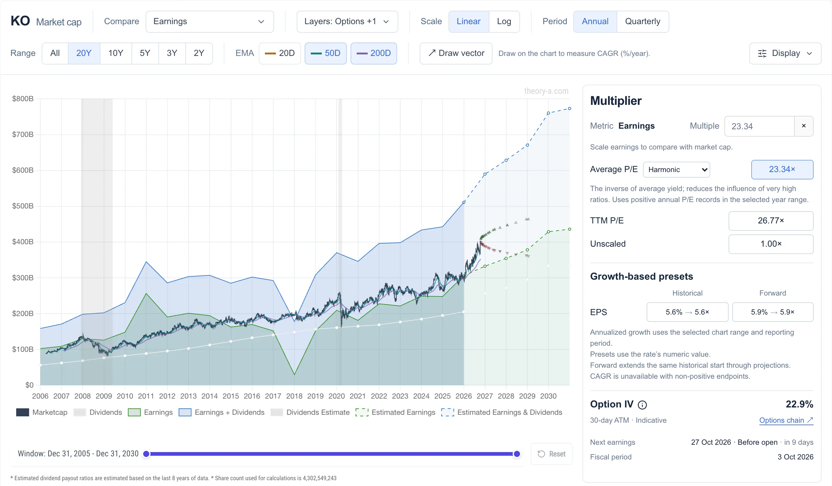 View full-size chart ↗
If you know FAST Graphs, you know this chart
Each part of a FAST Graphs chart has a counterpart on the Theory A analyze page.
| In FAST Graphs | In Theory A |
|---|---|
| Black price line | Market cap line, with 20, 50 and 200-day moving averages |
| Shaded earnings area | Green earnings area, plus a blue band for earnings and dividends |
| Orange line: earnings × 15 or a growth-based P/E | Type any multiple, or pick a preset based on historical or forecast EPS growth |
| Blue normal P/E line | Average P/E over the visible years: arithmetic, geometric, harmonic, median or least squares |
| Forecasting calculator | Analyst estimates drawn as dashed lines to 2030 |
Two differences matter when you read the charts side by side:
- Theory A plots market cap against total earnings rather than share price against earnings per share. The shape is the same, but buybacks show up as earnings per share growing faster than total earnings.
- Theory A uses reported net income, so one-off charges appear as dips. The deep trough in the chart above is Coca-Cola’s one-time charge for the 2017 US tax overhaul. FAST Graphs defaults to adjusted operating earnings, which smooth those out.
How the alternatives compare
FAST Graphs and Theory A are built around this chart, and Theory A’s version is free. GuruFocus’s Peter Lynch chart is the closest relative, and Koyfin can build one by hand. The rest value stocks in other ways.
| Tool | Price vs earnings chart | How it estimates value |
|---|---|---|
| Theory A | Yes, against earnings, sales, book value or cash flow | A multiple you set, average P/E or growth presets, against analyst estimates |
| FAST Graphs | Yes, the original | Earnings × 15 or a growth-based P/E, beside the normal P/E |
| GuruFocus | Peter Lynch chart (earnings × 15) | GF Value Line, its own fair-value estimate |
| Koyfin | Build it yourself with a multiplier | Charts and ratios you configure |
| TIKR | P/E history charts | Guided and advanced P/E-based models |
| Stock Rover | No | DCF fair value with a margin of safety |
| Simply Wall St | No | DCF fair value and Snowflake scores |
| Finviz | No | Ratios and screener filters |
| Stock Analysis | No | P/E history and financial statements |
More than the earnings chart
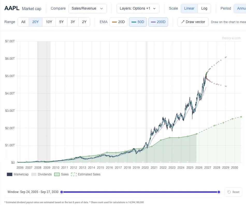
The same chart can compare price with sales, book value or operating cash flow. That helps with companies whose earnings are small or negative.
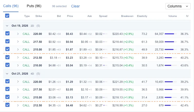
Theory A also has an options chain with live Greeks, and draws each contract’s breakeven on the same chart as earnings, so you can compare a trade with your view of the business. You can log trades in the options journal.
Which tool fits you
Theory A covers US-listed stocks only and uses reported rather than adjusted earnings. Another tool may suit you better:
- FAST Graphs, if you want adjusted operating earnings, Canadian and international listings, and its analyst accuracy scorecard. It has years of teaching material from its founder, Chuck Carnevale.
- GuruFocus, if you want the Peter Lynch chart alongside guru 13F tracking and a very deep screener.
- Koyfin, if you want to chart almost any series against any other and don't mind building the earnings overlay yourself.
- TIKR, if you want global coverage and consensus estimates.
- Stock Rover, if screening and portfolio analytics matter more to you than the earnings chart.
- Simply Wall St, if you prefer visual summaries over raw charts.
- Finviz, if you mostly screen and scan heat maps.
- Stock Analysis, if you mainly want clean financial statements.
Try it on a stock you own
Open any ticker on the analyze page and set the multiple to that stock’s average P/E. The earnings chart needs no account. See what Premium adds.
Open the stock analyzer →FAST Graphs, GuruFocus, Koyfin, TIKR, Stock Rover, Simply Wall St, Finviz and Stock Analysis are trademarks of their respective owners. Theory A is not affiliated with or endorsed by any of them. Theory A is a research tool and does not provide investment advice.